Mondrian was one of the early modern painters who explored ambiguous pictorial space. And in this computer meta-analysis of the “image features” of his paintings over time, we zoom out for another take on his body of work. His point of jumping off into total abstraction and moderated color happens late in the game. The computation further suggests –metaphorically –how we find ourselves as artists and viewers toggling between the concrete and screen worlds in the short space of one century. (Caution extreme math ahead. The video animation is fun though).
————————————————-
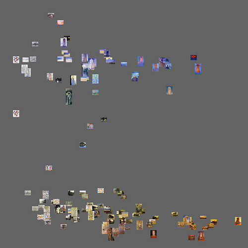
“Here is an example of the use of animation to show patterns in time. Mondrian’s paintings are plotted sequentially according to the year when they were painted; the year is shown in the upper left corner. (Note: Since we don’t know the exact dates of the paintings, a particular order used to render paintings in each year is not important.) Visualization uses a standard statistical technique called PCA (Principal Component Analysis) to project 60 different visual features calculated over each of Mondrian’s paintings into new dimensions. (PCA_1 is mapped into X, and PCA_2 is mapped into Y).
As previous visualizations, this animation maps visual similarity into distance. However, now distance codes similarity not along a single visual dimension such as brightness or saturation, but along dozens of dimensions combined together.
Digital image processing allows us to measure images on hundreds of other visual dimensions: colors, textures, lines, shapes, etc. In computer science, such measurements are often called “image features.”
We can map images into a space defined by any combination of these features. For example, the following visualization of Mondrian’s paintings maps uses average saturation to X-axis, and average hue to Y-axis. (X coordinate of an image = a median of all pixels’ saturation value; Y coordinate of an image is a medan of hue values.)
Although an average of all pixel’s hues may seem like a strange concept, this feature measurement turns out to be quite meaningful: it reveals that almost all of 128 Mondrian paintings created between 1905 and 1917 fall into groups: those dominated by yellow and orange (bottom) and those dominated by blue and violet (top).” Looks like this:
http://lab.softwarestudies.com/2011/06/mondrian-vs-rothko-footprints-and.html
Piet Mondrian Paintings